lettsalex
Tuesday, December 11, 2018
Magazine
I've always loved looking at whatever bizarre new stuff is headlining the world of fashion, so this idea really jumped out at me- it seems like such an obvious disconnect between product and consumer that I'm stunned the industry can make any money. I mean, look at that thing on my front cover- who would wear that?! But this isn't about my opinions on fashion, it's about my opinions on InDesign. Overall, I think I liked this program less than Photoshop or Illustrator, but I didn't exactly hate it. I think the hardest part was keeping the smaller text legible- a feat I'm not convinced I accomplished. But I'm glad to have learned what doesn't work now so that, should I need to in the future, I can use InDesign more competently and confidently.
Tuesday, December 4, 2018
Propaganda
I don't know why this uploaded all the extra space outside the page borders, but it provides a nice WIP look.
Net neutrality is a matter I feel very strongly about, so I immediately wanted to do a poster relative to it. And I feel that the constructivist Russian vibe really meshes with the tone of the piece- almost makes some extra suggestions about Russian hackers selling information. That's not directly linked, though- the poster's more about in-country service providers charging more for sites or streams that they know are more desirable. It's the most obvious attempt to change the law in the name of a sleazy cash grab, and I still can't believe it's passed. The idea of repealing net neutrality is distinctly un-American to me- so perhaps the Russian format is all too appropriate.
Thursday, November 15, 2018
Logos
While I hate to turn my back on any work of mine, I think this was by far my worst piece in this class. None of the logos turned out quite like I wanted- partially because I rushed it to make a deadline that I was wrong about. Had I taken more time, perhaps I wouldn't have quite this level of disdain for these works, but they are what they are and frankly these are just mediocre.
Wednesday, November 7, 2018
Calligram
Calligram
While my original idea utilized text straight from the movie, you requested that I use original text, and while at first I didn't appreciate the extra work that gave me I ended up really running with the restriction. Having to use new text let me experiment with different ideas- like using text relative to certain features, like having "he's lying to you" forming his mouth. I really like how it turned out, even if it isn't what I initially had in mind. Artists have to be able to roll with unexpected changes, so I appreciate having an exercise in that.
Tuesday, October 30, 2018
HTML
HTML
This piece might have been my favorite so far. I had so much fun fiddling with all the different commands and codes trying to get everything just right, it was a ball. It probably helped that I've got a fair amount of coding experience, so most of this was stuff I've either experienced firsthand or have seen similar techniques. But even the stuff I've never used was a blast to figure out.
This piece might have been my favorite so far. I had so much fun fiddling with all the different commands and codes trying to get everything just right, it was a ball. It probably helped that I've got a fair amount of coding experience, so most of this was stuff I've either experienced firsthand or have seen similar techniques. But even the stuff I've never used was a blast to figure out.
Tuesday, October 2, 2018
I'm a Toy
I'm a Toy
I had a lot of difficulty achieving the effect I wanted with this piece- in fact, I'm still not fully sold on it. But the opportunity it gave me to experiment with my effects did not go unused. It certainly helped to use this particular photo format- having examples of the statues I'm trying to replicate right next to the one I'm working on helped immensely. I'm not entirely satisfied with how this piece turned out, but I certainly know I gave it my all and it came out well enough.
I had a lot of difficulty achieving the effect I wanted with this piece- in fact, I'm still not fully sold on it. But the opportunity it gave me to experiment with my effects did not go unused. It certainly helped to use this particular photo format- having examples of the statues I'm trying to replicate right next to the one I'm working on helped immensely. I'm not entirely satisfied with how this piece turned out, but I certainly know I gave it my all and it came out well enough.
Tuesday, September 25, 2018
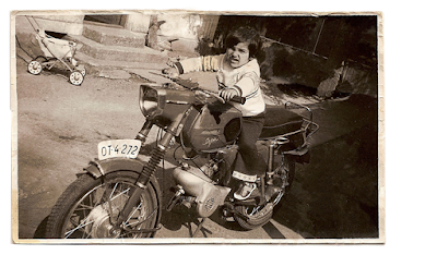
Restoration
 |
| Final Product |
 |
| Work in Progress |
Subscribe to:
Comments (Atom)


